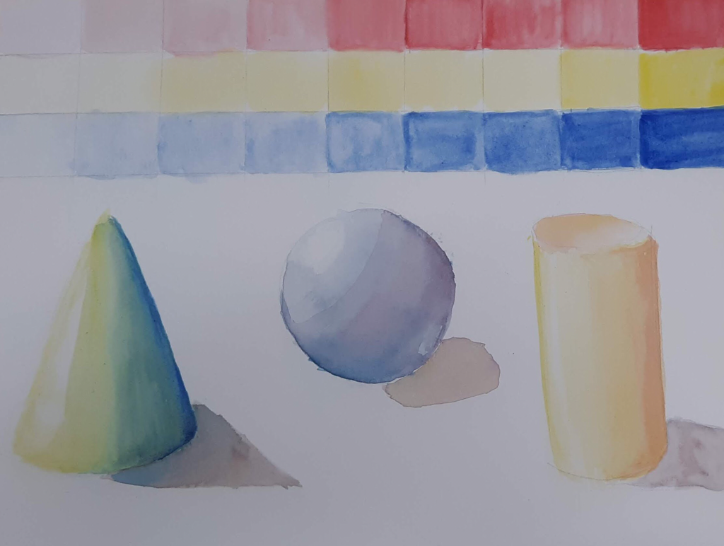
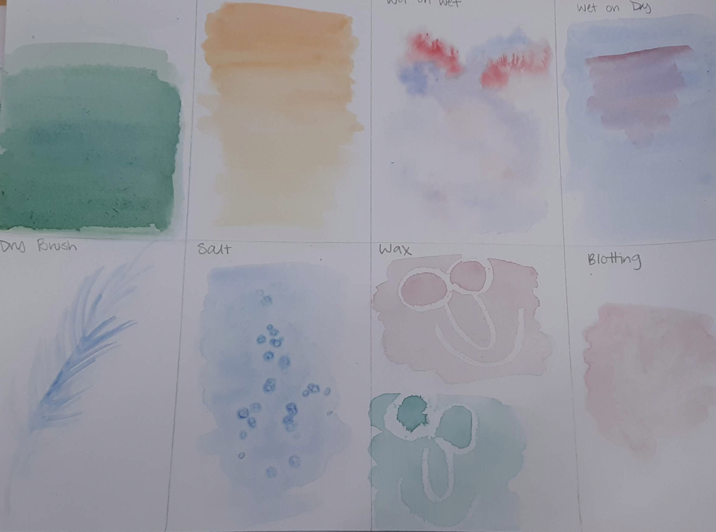
This is the practices of watercolor before final piece. First is mixing and shading practice under washes of the cool tone primaries. I had to think about white spaces to leave blank while I worked, which was the most challenging part of shading. In the next picture are techniques, my favorite of which by far was the wet on wet. Super soft mix of colors is very pleasing on the eye.
0 Comments
I've done these 4 drawings before in art 2, and I hope I've shown improvement since then. I tried to make the tree as dynamic as possible while still looking rooted in the environment. I know for a fact that the hand position I used for art 2 was a very simple one, and this year I decided to shake it up and cross my fingers. The animal one I didn't use the whole page as I had hoped to do, but I think I really captured the essence of my dog Mochi. The street scene I know for a fact has improved since art 2, but still has a way to go.
 In this practice, I had to mix colors and play around with washes. My first apple is monochromatic, and the paper started to pill up a little as it did with the next one, which was a complementary color scheme. One thing I can do to combat that in the future is work in lighter washes, and leave more time to dry in between each. Monochromatic is always a good practice no matter what the medium, because you are forced to look at the lights and darks and really know where to put them in order to create the illusion of space on a 2D plane. If I were to do this again, I would have pushed the mid-tone a little more, as I feel like it's lacking and therefore takes away from the 3D illusion. The warm and cool color palettes were my favorite to do, especially the cool colored one, as I feel I did the best in creating space and also I feel like it looks a little enchanted.
|
Archives
January 2020
Categories |


 RSS Feed
