|
This place is on the Hudson River in Manhattan. It's important to me because my grandparents live down the street so we walk to the docks at sunset to see the view. For me, I enjoyed every bit of this painting, from creating it to seeing the final picture. Everything went really smoothly and I would not change it at all if i did it again!
I chose four things in my piece to represent me. I chose a piano,, a camera, a sketchbook, and a painting. My most successful part of the piece was the painting of the painting (haha) because the texture of my painting matched the texture of the real painting I have hanging on the wall in my house. One thing I would change is that the colors of the camera are too close to the colors of the piano, so when I went to paint the camera on top of the piano, the two sort of blended together. I picked acrylic as my medium because it was the more realistic looking of the two choices, so I could make it as close to the photo as I could.
My partner from the AP art class, Leila, has taken a multitude of art classes during her time at Apex High. Some include Arts 1,2, 3, and 4 and Drawing 1 and 2. She's such a bright and happy person, and her art style is so original and cool! The link to her weebly is leilad17.weebly.com . I bet we’re going to have a lot of fun and I look forward to collaborating with her in the future! 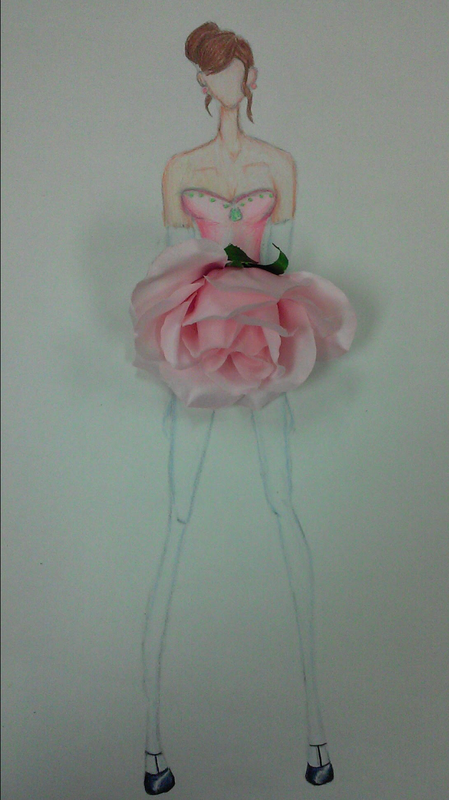 I morphed a dress with a flower for my project, because the petals of a flower often look like the skirt of a dress. To do this, I first drew a sketch of a fashion model, who in drawings are often not actually proportional. Instead of being 7 heads tall, they are usually 9. Then, I planned which flower I would use for the skirt of the dress. After that, I drew a sketch of what I wanted the top of my flower dress to look like. When my sketch was finished, I traced it on to larger paper, leaving a space where the flower will fit on the skirt. I colored it using Prismacolor colored pencils, and then put the flower on top! One thing I struggled with during this project was using the Prismacolor pencils because I had never used them before. Her skin ended up being a little more orange than I had hoped because the pencils didn't have a peach skin color so I had to mix the colors together. I now sort of know how to work the pencils.
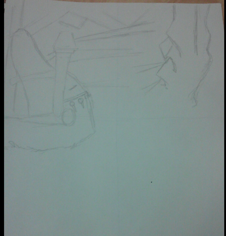
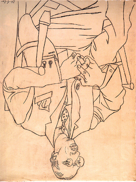
This is the warmup I benefited most from for this drawing, on the left is my unfinished warmup and on the right is the actual picture. It taught me how to see lines instead of things and also taught me to not symbolize as I was drawing (That's a foot, that's a leg), but more see the drawing as it is and as it should be: a bunch of lines.
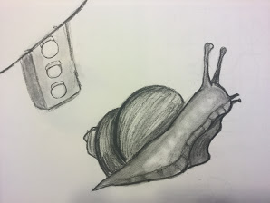 Illustration Friday- Traffic
I chose to draw a snail for this week because snails are slow like traffic is and I thought it would be a funny way to show how long people have to wait for traffic sometimes. Different Mediums~
-Charcoal~Charcoal is amazing to use if you want the blackest black or a very wide range of values, the only problem is that it's a really messy medium, so you have to be very careful when drawing/sketching. -Pen~Pen writes really crisp and precise. It makes a piece look very finished/finalized. A con to drawing in pen would be that you can't erase pen if you make a mistake. -Pencils~Pencils are the go-to drawing tool and they are super easy to use. The gradient in pencils is really smooth, so making things 3-D is easy with this medium. When you are smudging with your fingers, the graphite can get on your fingers and it can get a little messy. |
Archives
January 2017
Categories |
 RSS Feed
